10 Brand Identity Examples for Creatives
October 3, 2024
A strong brand identity does more than catch the eye – it tells your story, builds trust, and creates a sense of belonging for your audience. The brand identity examples for creatives I share in this blog post all do this in different and unique ways.
Brand personality is what makes someone choose your handcrafted ceramics over mass-produced mugs, or pick your photography services when there are countless options out there.
We’re constantly bombarded with choices, but your visual identity makes you stick in the minds of your target audience.
As a brand and website designer, I often work with creatives who feel like they’re trapped in a cocoon and can’t express their brand authentically.
If that’s how you feel, too, browse the 10 creative brand identity examples below for more inspiration as you’re crafting an instantly recognizable brand!
What Is a Brand Identity? And Why It’s Important for Creatives
For creatives, a memorable brand identity is a way to draw your community in and make them resonate with your personality and what you offer. A good brand identity mixes your unique skills, values, and vision to create a presence that’s uniquely you.
You don’t have to shout the loudest, but you do need a cohesive brand identity that paints an authentic picture of who you are and what it’s like to work with you.
The statistics speak for themselves:
- 81% of customers need to trust a brand before buying from them, and 86% of consumers believe that authenticity is important to support a brand.
- Having consistent brand presentation across all platforms can boost your revenue by as much as 23%.
- 89% of shoppers stay loyal to brands that share their values.
In other words, how your brand presents itself matters – a lot.
Browse these Showit website examples for more inspo!
How to Develop a Brand Identity
Creating a strong brand identity combines self-discovery with strategic planning. I like to think of the process as having 4 steps: research, creative strategy, design phase, and implementation.
Research
Before you dive into colors and fonts, you need to do some soul-searching. Market research is incredibly important for your brand message and identity but as a creative entrepreneur, who you are is a crucial piece of the puzzle, too.
What drives you as a creative entrepreneur? What do you value, and what makes you excited to work on client projects? Think about your vision for yourself.
These aren’t fluffy questions. As a creative, you are a huge part of your brand’s visual identity, so it’s essential to get aligned on who you are and who you want to be in your professional life.
Once you have a strong understanding of who you are as a creative business owner, it’s time to research your target audience and figure out what matters to them.
While you’re at it, take a look at your competitors, but don’t get caught up in comparison. Instead, use their brands as inspiration for what resonates with you (and what doesn’t).
Your goal isn’t to blend in.
Creative Strategy
Once you have an idea of what you want your brand identity to be, it’s time to strategize and brainstorm different visual ideas.
This is when it becomes incredibly beneficial to work with a brand identity designer who gets your personality and vision.
Also, read these personal branding tips for creatives!
Design Phase
This is where your brand starts to come to life visually. During the design phase, you’ll work on creating all the visual elements that will represent your brand.
This typically includes:
- Logo design (with variations for different uses)
- Color palette selection
- Typography choices
- Iconography
- Patterns or textures
- Photography style
- Social media templates
- Business cards and other print materials
You should make each element reflect your brand’s personality and resonate with your target audience. If you’re working with a designer, they’ll present you with mood boards and concept designs before finalizing anything.
Implementation and Guidelines
It’s time to put your strong visual identity to work! To stay consistent with your marketing, it’s important to create brand guidelines.
Brand guidelines are basically a rulebook for your visual identity. They ensure that no matter who’s working with your brand (future employees, service providers, or even yourself on a busy day), everything stays consistent.
Your brand guidelines should include:
- Proper usage of your logo
- Your color palette with exact color codes
- Typography rules (which fonts to use where)
- Guidelines for imagery
If you’re working with a copywriter, you’ll also include brand messaging guidelines in this guide.
10 Swoon-Worthy Brand Identity Examples for Creatives to Get Inspired
1. Sezane
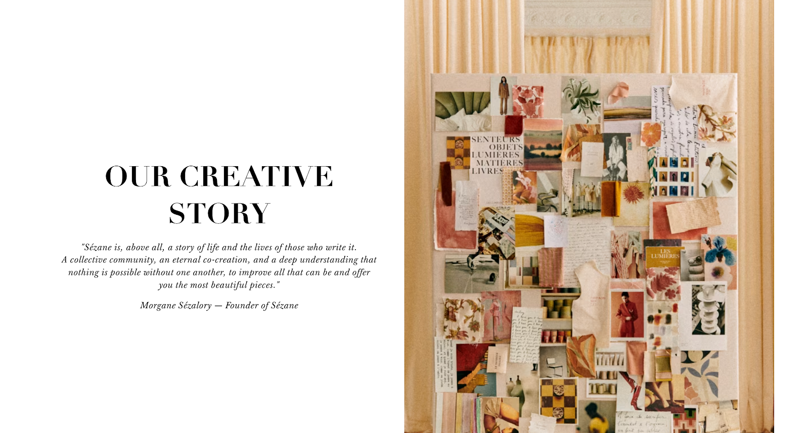
Sézane is a clothing brand that crafts beautiful, limited-edition pieces that are made to last and be passed on, all at fair prices and without middlemen.
I’m obsessed with their branding, which exudes effortless French elegance and sophistication. Plus, they incorporate unique details that make the experience of shopping feel super luxe.
When you receive a package from them in the mail, it’s luxurious and substantial. They pack their clothing in tissue paper that has gorgeous illustrations, and it’s honestly such a joy to open it.
2. The Vibrant Tapestry
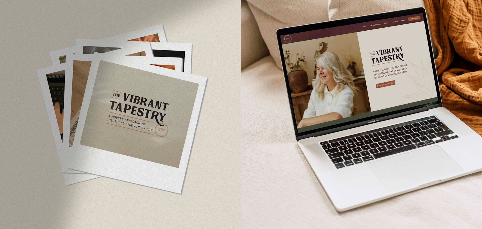
One of my client projects, The Vibrant Tapestry is an online therapist for aging adults in Washington state. Renee’s mission is to honor the unique stories, perspectives, and complexities of aging adults and support them to grow during their current challenges.
For this brand identity example, we needed to strike a delicate balance between warmth and professionalism. The Vibrant Tapestry’s color palette has soothing, earthy tones that evoke a sense of comfort and stability.
At the same time, the website design is clean and uncluttered, making it easy for potential clients to find essential information and book a consultation call.
3. Magnolia
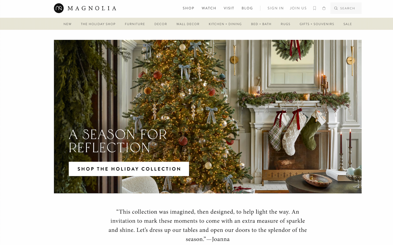
Here’s one of the best brand identity examples for creatives! Chip and Joanna Gaines, the husband-and-wife duo behind Magnolia, have turned their HGTV fame into a lifestyle empire. Their visual identity is a blend of rustic and modern, and Magnolia’s color palette is predominantly neutral, with lots of whites, creams, and earth tones.
Magnolia makes you feel like you can create a home that feels both sophisticated and lived-in – a space that tells a story. This approach has cultivated a loyal following that doesn’t just buy Magnolia products but also aspires to the Magnolia way of life.
4. Ohana Homes
Ohana Homes is run by Mercedes, a realtor and real estate broker based in Portland, Oregon. She helps people feel empowered, educated, and confident about buying and selling property – and ultimately building generational wealth.
The brand’s visual identity is warm and inviting, with a color palette that includes rich and earthy tones. This combo creates a sense of groundedness and possibility, which speaks to people who are about to make a significant life decision.
I love their unique logo, too (designed by yours truly!).
5. Loro Piana
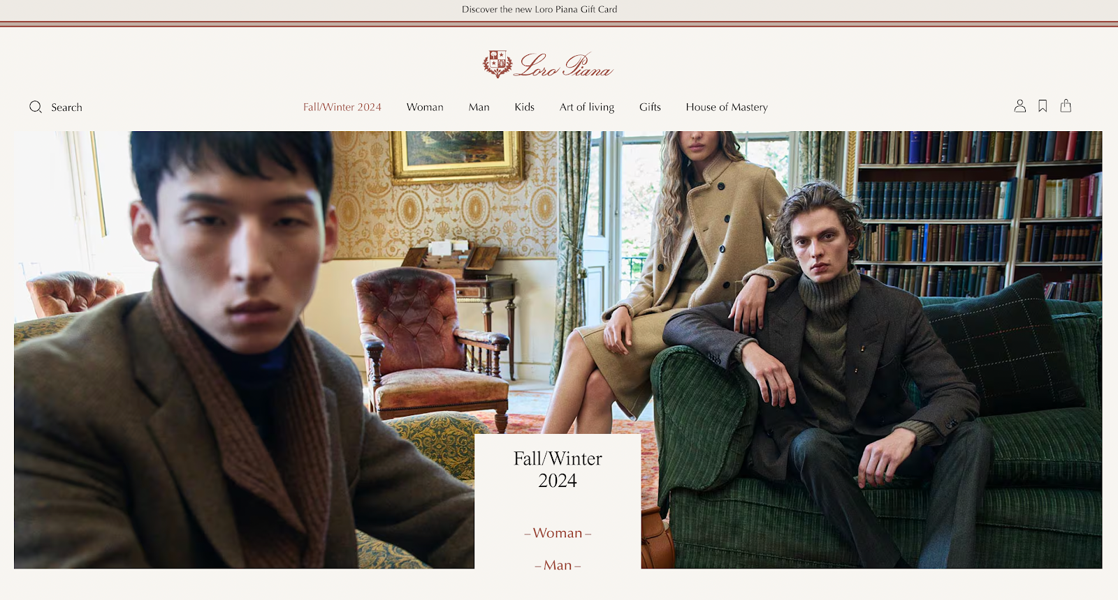
Loro Piana is one of the best brand identity examples, and I might be biased because I’m a sucker for a good fall color palette – which Loro Piana executes beautifully.
The brand’s visual identity is understated yet unmistakably luxurious, and the color scheme and illustration style on the website are to die for!
6. Painted By Sloan
I often work with wedding professionals, and one of my favorite projects has been for Painted by Sloan! Sloan is a live wedding painter based out of Denver, and she’s on a mission to capture life’s finest moments for her clients at weddings in Colorado and across the United States.
Sloan wanted her brand perception to communicate a high-end aesthetic that connected with clients looking for a sophisticated live wedding painting experience. We went for elegant and dreamy vibes, full of soft and romantic hues.
7. Filson
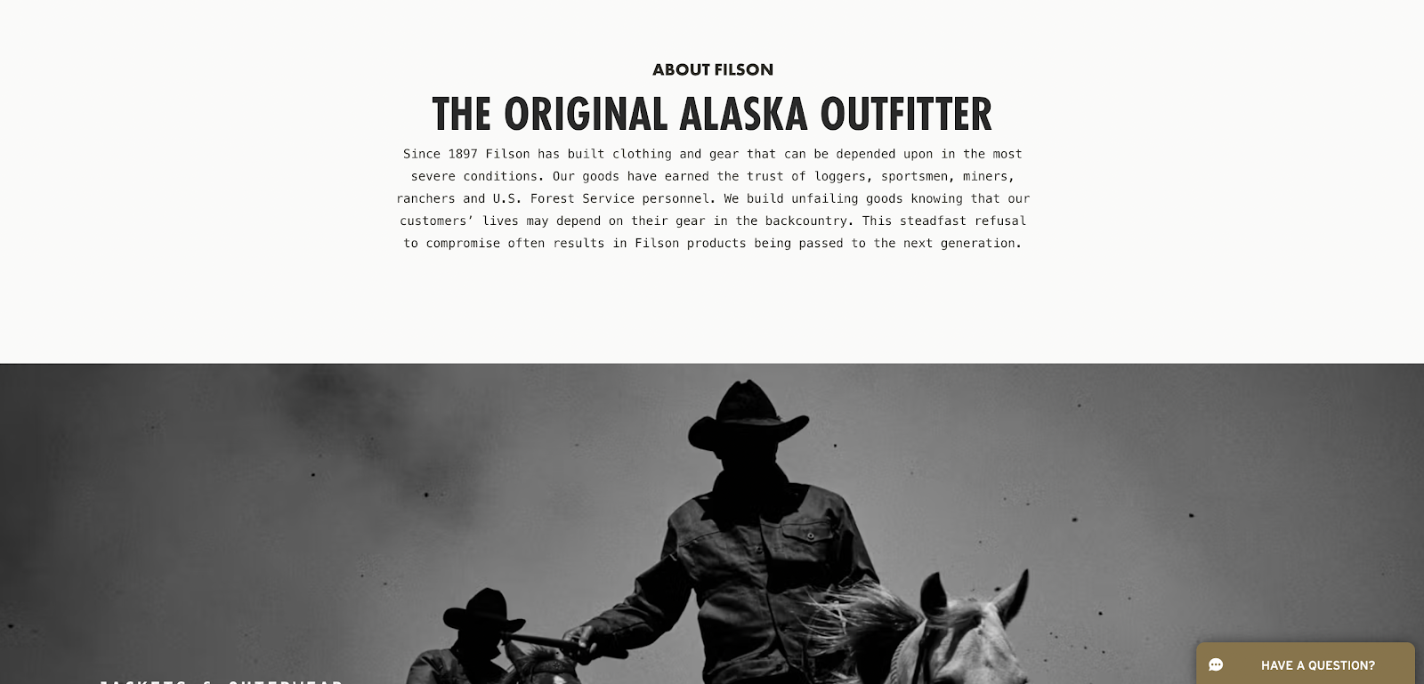
Filson, a heritage outdoor clothing and gear brand founded in 1897, has a brand identity that’s as rugged and dependable as their products. Their long-standing reputation for quality and durability is woven into every aspect of their branding.
Their brand and website are clean and functional. They prioritize product information and heritage storytelling over flashy design elements, which works well for their brand’s identity and brand voice.
This is a great example of how a brand is more than just a logo. It’s an overall impression, a reputation. Filson used to have a brick-and-mortar store in a shopping center near me, and all I can say is while their items are pricey, they absolutely ooze quality and craftsmanship.
Their bags are definitely on my wish list!
8. Devin Tormey Art
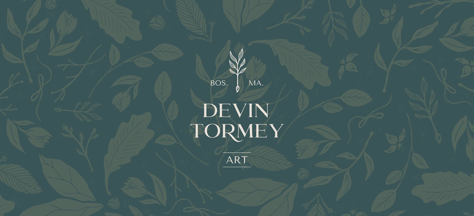
Another one of my favorite brand identity examples I’ve created for a client, Devin Tormey is a live wedding painter who lives in Boston and works with clients in New England and all over the United States. She captures and creates heartfelt, handcrafted, heirloom-quality live wedding paintings to celebrate unique moments.
Devin’s brand was growing in a more high-end direction, so she needed a visual identity that connected with a more sophisticated client base. Her branding now has rich, warm, and earthy tones that evoke true artistry and romantic celebration.
9. The Relatable Therapist
Here’s a more colorful, bold, playful, and unexpected brand identity example that I created for Saysan, The Relatable Therapist in Seattle, Washington.
She’s on a mission to provide a down-to-earth, informal, and even fun environment for her clients to explore and develop through challenging life transitions, so there’s no stuffiness here!
Saysan’s color palette and other visual elements intentionally mirror her cool and modern approach to virtual therapy.
10. Native Landscapes and Gardens
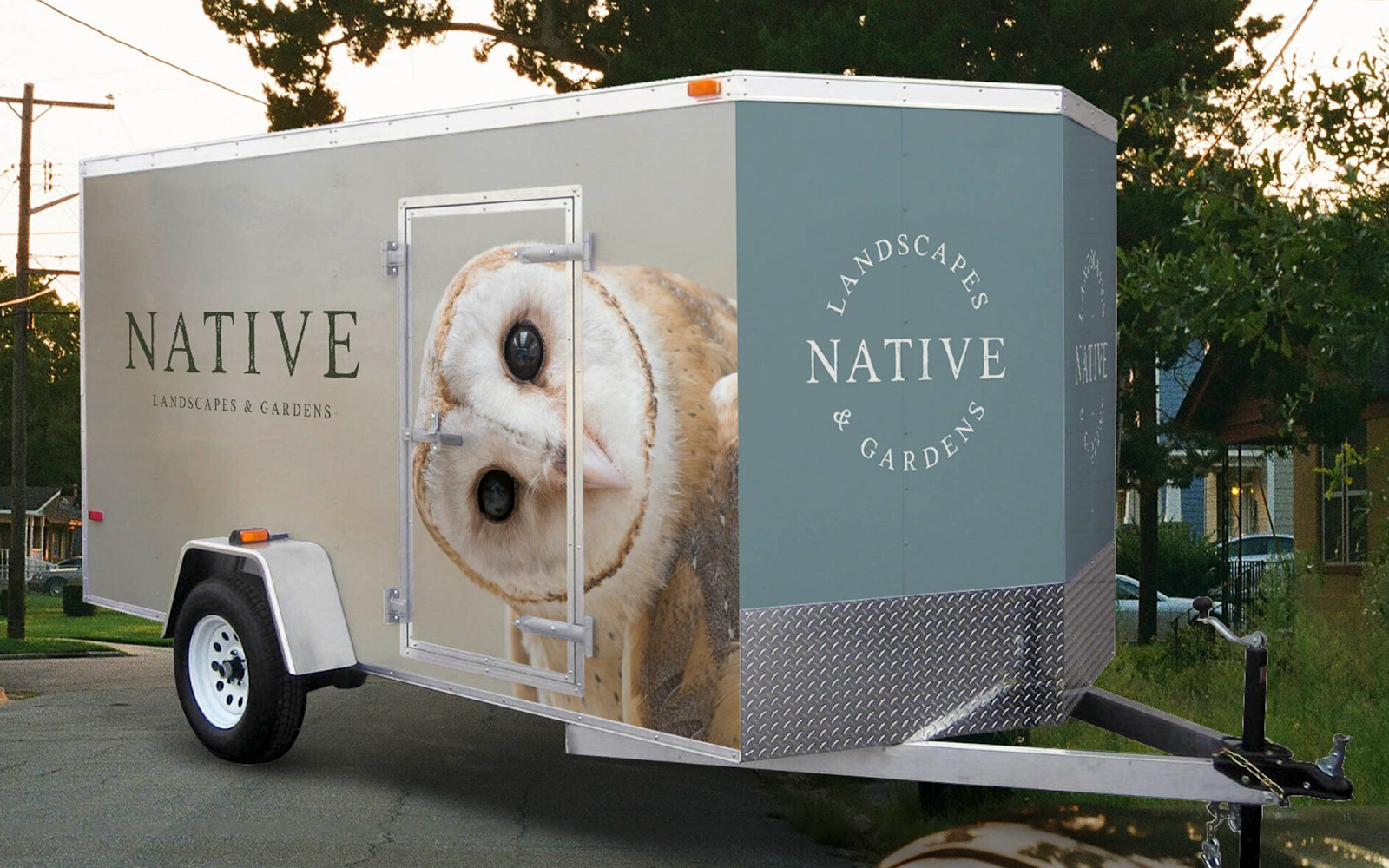
I love seeing my work out in the physical world, which is why Native Landscapes & Gardens is such a special project for me! Marc’s goal as the owner is to provide clients with sustainable, eco-friendly landscape and garden designs that incorporate easy-to-maintain native plants.
Native’s custom brand design is earthy yet sophisticated — designed to reflect his company’s natural and sustainable landscape design approach.
How to Build a Strong Brand Identity
To inspire brand loyalty, your brand identity needs to be more than surface-deep. It should be an authentic reflection of your creativity and a compelling visual story. It also needs to leave room for evolution and let your quirks shine through!
Most importantly, it’s essential to stay consistent if you want to build a successful brand as a creative. All of your marketing materials and channels should have a consistent color palette, logo, tone of voice, and, overall, strong personality.
FAQs
How Do You Show Brand Identity?
The most important aspect of showing your brand identity is being consistent across all touchpoints. This means your website and social media presence, but also the way you work and interact with clients.
Small special touches go a long way – from the eco-friendly packaging of your handmade products to the backdrop in your Instagram stories. The key is to turn your target audience’s interactions with your brand into a cohesive, branded experience.
What Are the Key Elements of Brand Identity?
The key elements of a brand identity are your brand’s mission, values, and personality – the “why” behind everything you do. Visually, you at the very least need a logo, color palette, typography, and imagery style. Your brand voice (the tone and style of your communication) should also be carefully curated to reflect your personality and vision.
Many creatives work with designers and copywriters to shape their brand identity and marketing efforts.
Is Brand Identity Same as Branding?
Many people use the words “brand identity” and “branding” interchangeably, but they’re not exactly the same thing – although they’re very closely related. Branding is the collection of all of the elements that make up your brand, from your visual style to your brand messaging, values, personality, and reputation. Brand identity typically refers only to your visual identity or other visual aspects of your brand experience, (such as product packaging).
Get Earthy and Sophisticated Branding for Your Creative Business
I work with many creatives who find it hard to blend all the elements of their personality and vision into a cohesive brand identity that leaves a lasting impression on their target audience.
With a visual identity that feels exactly like you, you can build trust, create confidence, and grow your business. Learn more about my branding and Showit web design services!
About the Author:
Rose Benedict
Owner and Designer, Rose Benedict Design
Rose Benedict is a brand and website designer for therapists, creatives, artists, and service providers. Rose is also a Showit Design Partner and the owner/designer at Rose Benedict Design. She has been a designer for the past 10 years and has worked at a Fortune 15 company and top university in Columbus, Ohio. She brings both her brand/website design and technical experience to small business owners so that they can thrive and deeply connect with their ideal clients. Outside of work, Rose loves reading, pilates, gardening, and traveling (10 countries and counting!).
Rose Benedict Design is a brand and Showit web designer based in Columbus, Ohio, devoted to crafting beautiful, strategic brands for creatives and service providers.
©2022-2026 ROSE BENEDICT DESIGN
Rose Benedict Design is a proud Showit Design Partner.