Website Design for Photographers: Tips & Examples
November 5, 2024
Website design for photographers is arguably the most important piece of your brand identity. As a photographer, you are the first person to understand the power of visual storytelling!
Your photographs tell stories through carefully crafted moments. Your website should do the same.
When done well, your website becomes an extension of your photographic style, creating an experience that resonates with the right people and leads to meaningful client relationships.
As a Showit website designer, I often work with photographers and other creatives. In this blog post, you’ll learn tips on how to build your own photography website. I’ll also share a few photography websites I’ve designed for clients in the past as inspiration!
Is It Worth Having a Website as a Photographer?
Yes, having a website as a photographer is essential.
Whether you’re just starting as a creative entrepreneur or have been a photographer for years (and your website now desperately needs an update to reflect your growth…), here’s why having a professional website is so important:
- It provides a seamless way for potential clients to explore your full body of work, understand your process, and connect with your artistic vision
- Your website gives you complete creative control over how your work is presented – from the layout and flow to the design elements that complement your images
- Having a professional website establishes trust with potential clients who are considering making a significant investment in your services
- It helps potential clients find your photography business through search engines
Social media platforms can be powerful marketing tools, but they shouldn’t be your only online presence – algorithms change, formats shift, and your content gets mixed into busy feeds.
Having your own photography website gives you much more control over your marketing! This is why website design for photographers is so important.
What You Need to Have on Your Photography Website
Your website’s main goal is to help your visitors understand your work, process, and personality. Here are the essential pages to include:
- Home Page: This page should immediately convey your style and the type of photography you specialize in. Feature your strongest images here, but be selective – quality over quantity!
- About Page: This is where you share your story and approach. Beyond just listing your experience and expertise, share what drives you to capture moments through your lens and a little bit about your personality.
- Portfolio Page: Your photography portfolio is one of the most important pages on your website! This is where your prospective clients get a deeper sense of your style and skill.
- Services & Pricing Page: Be transparent about what you offer. You don’t need to list every package detail, but adding your starting prices or investment ranges helps set clear expectations and qualify leads.
- Contact Page: Potential clients need a reliable way to contact you, and it’s a good idea to let them know how quickly you’ll respond to their inquiry.
You should also include social proof throughout your website pages. This could include podcasts you’ve been featured on, awards you have won, publications your work is featured in, or reviews from happy clients.
Social proof helps potential clients feel confident in their decision to work with you!
Depending on your goals, your photography website may also include client resources, a blog, password-protected galleries, email newsletter sign-up, and more.
Website Design for Photographers: 7 Tips
As a Showit Design Partner, I adore working with creatives.
Many of my clients are photographers, so over the years I’ve developed tips that apply specifically to photography websites. Here are my top 7!
1. Make It Easy to Navigate
Your website should make it easy for your prospective clients to find all of the information they need and get a sense of your photography style and process.
Don’t overcomplicate your website! It can be tempting to include everything on every page to showcase the depth of your expertise. But if your website is confusing, your leads will bounce.
People spend an average of 5.59 seconds reading written content on websites. During this time, you should hook them and make it easy for them to learn more about your photography services.
Here’s how to do that:
- Keep your main menu simple with clear, descriptive labels
- Include strategic calls-to-action (CTAs) that guide visitors to learn more about your services or get in touch with you
- Create clear pathways between related content (like linking from portfolio pieces to relevant service pages)
- Make sure there’s a purposeful + streamlined logic to the sequence of your website sections
Your main goal is to attract clients with your photography style and visual storytelling while making it easy for them to get the info they need (your packages, pricing, etc).
2. Express Your Photography Style in an Authentic Way
Website design for photographers should feel like a natural extension of your work.
If you photograph dreamy beach weddings, perhaps your design incorporates soft, coastal elements and airy spaces. For urban photography, consider incorporating architectural elements and strong lines.
The key is maintaining consistency between your photography style and your website’s visual language. This alignment helps potential clients immediately understand your aesthetic and whether it matches their vision.
3. Be Serious About Your Branding
Professional personal branding creates a cohesive experience that reflects your personality and the quality of your work. This means:
- Choosing logos and fonts that complement your photography style
- Developing a color palette that enhances rather than competes with your images
- Maintaining consistent visual elements throughout your site
- Creating a signature look that distinguishes you from other photographers
People are pretty savvy these days, and they can often spot a DIY-ed brand and website. DIY-ing can be great! But my word of caution on this topic is to make sure your branding and website feel professional so you don’t accidentally give the impression of this being a side hustle or hobby.
In short: high-quality branding curates a high-quality impression of you and your work.
Keep your branding consistent throughout the website! This also involves selecting the photography work that best represents you and appeals most to your target audience.
4. Spend Time on SEO
Search Engine Optimization (SEO) is how you help potential clients find your website when they’re searching online. When someone types “wedding photographer in Portland” or “family photographer near me” into Google, SEO determines whether your website appears in their search results.
Local SEO is particularly valuable for photographers because most clients are searching for someone in their specific area.
Here are a few SEO tips for photographers:
- Include location-specific terms naturally in your content (ex: “Columbus wedding photographer,” “Downtown Seattle family sessions”)
- Create location-specific content about popular shooting venues and locations in your area
- Optimize your images with target keywords in your file names and alt text
- Start a blog where you can post about recent sessions, local venues, behind-the-scenes stories, and helpful tips for clients
- Make sure your site loads quickly by properly sizing images
It’s also important to use a website builder for photographers that supports best SEO practices.
This is one of the reasons why I’m so passionate about Showit! It’s amazing for SEO and makes it easy to keep the pages on your website optimized for search engines.
5. Show Your Personality
People want to hire a photographer that they feel connected to! Showcasing your work is important, but you should also share who you are as a person and as a photographer.
Your About page is a great place to do this, but it’s also important to naturally incorporate your personality throughout your photography website. Here are a few ideas for the things you can include:
- Your approach to photography and what draws you to specific types of shoots
- What clients can expect when working with you
- Your creative process and how you help clients feel comfortable
- Your background, professional accomplishments, and credentials that build trust
- Personal touches that help clients connect with you, such as fun facts and things you’re passionate about (doesn’t have to be related to photography!)
There’s a Harvard professor (Gerald Zaltman) who wrote an entire book on purchasing decisions and determined that 95% of them are subconscious.
In other words, you can list all of the logical reasons why your potential clients should hire you (how in-depth your packages are, your editing skills, etc.) but what’s ultimately going to help them make their decision is how connected they feel to you.
Here’s an example of a personality-driven About page I designed for one of my clients, Barefoot Royalty Photography – a wedding, elopement, and couples photographer in Georgia.
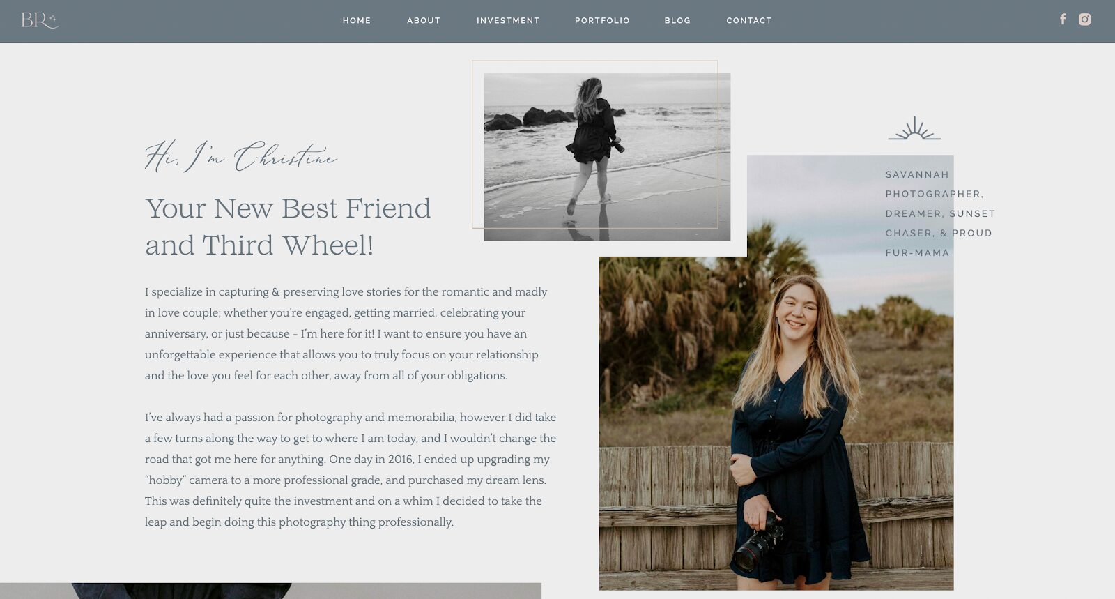
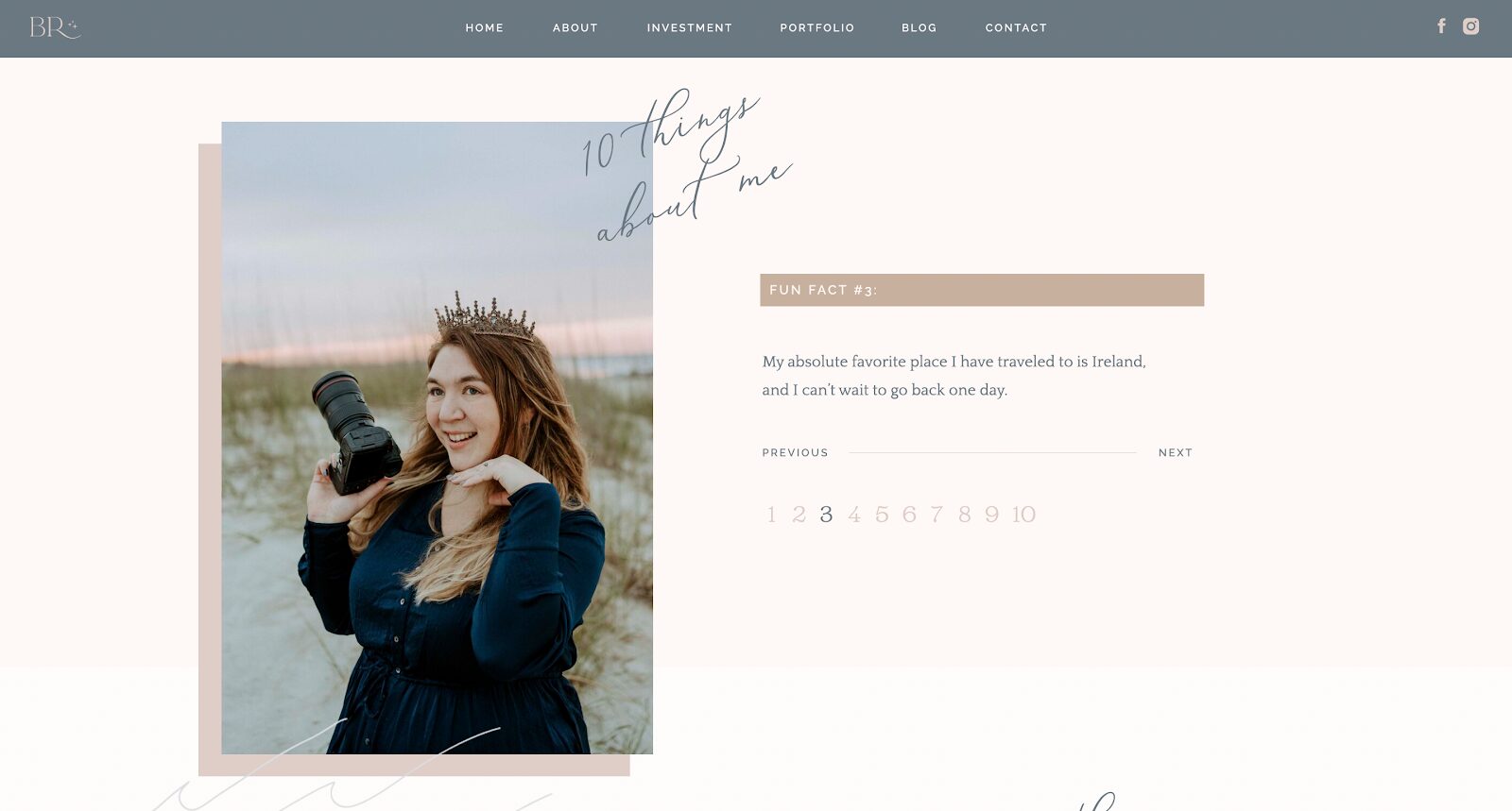
On Christine’s About page, we included both her background story on how she became a photographer and personality bits about her. This helped her start attracting more aligned clients!
6. Curate Your Portfolio
Here’s a hard truth about your Portfolio page: It’s not good to overwhelm people with hundreds and hundreds of photos (even if they’re amazing!). You should curate your portfolio and be intentional with what you include.
Consider:
- Creating separate galleries for the different types of photography you offer
- Organizing images to tell a complete story of each session or event
- Limiting each gallery to 20-40 of your strongest images
You should also update your Portfolio regularly with recent work. When I work with photographers on creative website design, I help them intentionally organize their Portfolio pages and photo galleries!
7. Optimize for Mobile
Over 60% of website traffic comes from mobile devices. This means that it’s likely that over half of your website visitors are using their phone to browse! If your photography website isn’t optimized for mobile, it’s going to be hard (or virtually impossible) for people to navigate it.
Make sure that:
- Images load quickly and look sharp on smaller screens
- Text is readable without zooming and there are no weird cut-offs
- Photo galleries are easy to navigate
- Your contact form is easy to fill out on mobile devices
- Menu navigation is user-friendly and intuitive on smaller screens
Not all photography website builders allow you to optimize your website for mobile (or at least optimize it well). This is another reason why website building on Showit is so great – it allows you to create a completely separate mobile version of your website.
Here are 10 Showit website examples you’ll love! 😉
What Is the Best Website Builder for Photographers?
I’m a Showit Design Partner, which may mean that I’m a little biased when I say this…but Showit is hands down the BEST website builder for photographers!
I’ve been doing website design since 2015 and experimented with all kinds of different platforms in the past, and none of them compare to the creative freedom Showit offers.
Especially for photographers, other website builders don’t have enough advanced features, customization, and flexibility with user-centric design. Check out my Portfolio to see all of the websites I designed in Showit!
Website Design for Photographers Examples
Barefoot Royalty Photography
I love working with couples and wedding photographers!
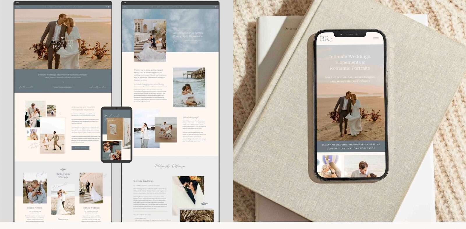
Christine is based near Savannah, Georgia, and her photography business – Barefoot Royalty Photography – is all about capturing heirloom photos of the romantic and madly in love. She can take photos of your date night, anniversary, elopement, or intimate wedding.
Christine wanted her branding and small business website to convey a high-end, romantic, and coastal-inspired look while highlighting her photography work. Her design choices – soft, sandy neutrals paired with deeper ocean blues – create an immediate connection with her ideal couples.
Heirloom Photo Company
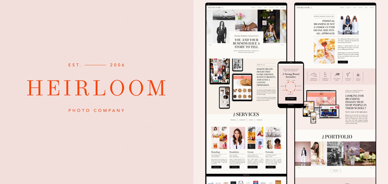
Rita’s Kansas City studio specializes in brand photography that tells compelling visual stories for branding, headshots, and corporate events. Her mission is to bring clear and consistent messaging to brands’ visual presence so they can thrive!
Rita booked a custom Brand and Showit Website Design package with me. Heirloom Photo Company’s website balances vintage-inspired elements with modern sophistication – much like Rita’s photography style. It’s sophisticated, nostalgic, and vivacious, and the website tells a cohesive visual story.
Aspen Tree Films
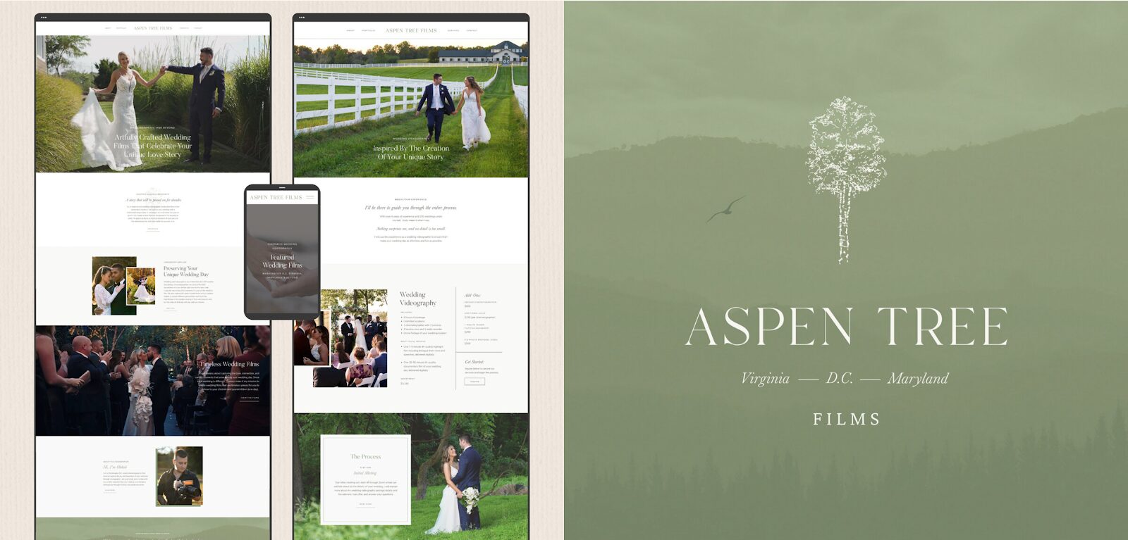
Oleksii, the owner of Aspen Tree Films, is a wedding videographer based in Washington D.C. He creates artfully crafted, cinematic wedding films for his clients and captures the joy, movement, and special details of each couple’s special day.
He’s not a photographer, but his work is closely related to visual storytelling, so I think he’s a great addition to this list!
I created branding and website design for Aspen Tree Films, focusing on evoking an elegant, minimal, and sophisticated feeling to resonate with his ideal clients. Oleksii’s soft green color palette is inspired by the natural environments in which his weddings are usually filmed!
Robert Hinkle Photography
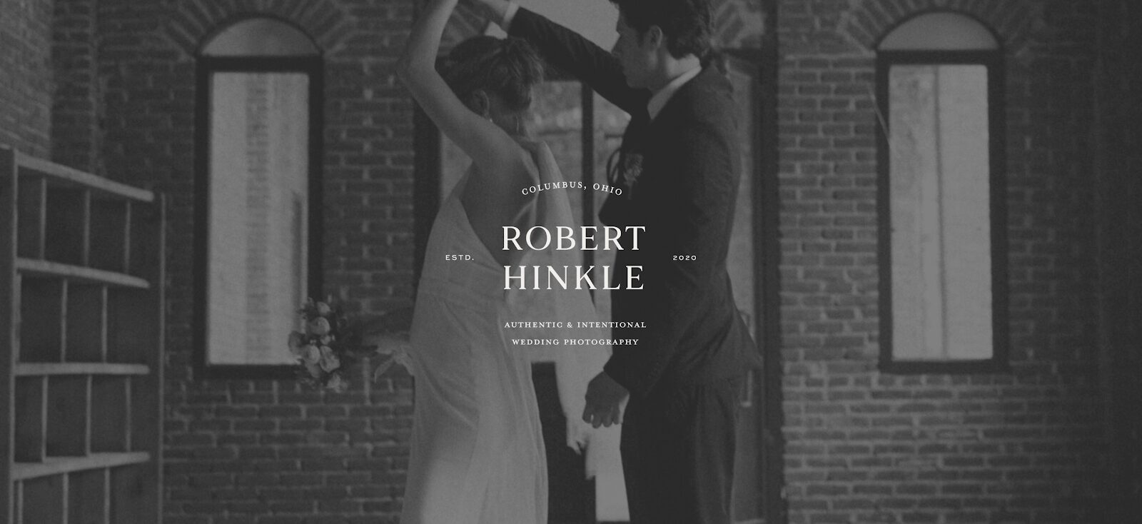
Robert Hinkle specializes in wedding photography for couples in Columbus, Ohio (where I’m based!). His mission is to empower clients’ love stories before, during, and long after their wedding celebration by providing a personal, relational client experience and high-quality heirloom photo albums.
I didn’t design Robert’s website, but I created his brand identity – which is equally as important. It focused on warm neutrals and minimal, high-end touches that combine both classic and modern sensibilities.
Robert was able to use his new brand identity together with photography-specific templates for websites to launch his own website! This can be a good option if you’re on a budget.
Brooke Lynn Photography
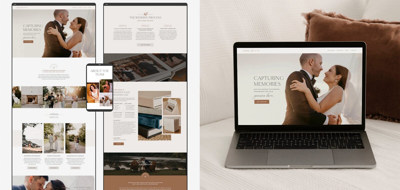
Brooke Lynn is a wedding photographer in Elkton, Maryland. She captures and showcases the genuine connection between two people – whether at their proposal, elopement, or wedding celebration.
Brooke booked a custom Brand and Showit Web Design package with me, and we focused on creating a natural and earthy yet refined aesthetic. Her new website highlights Brooke’s amazing photography and creates a smooth and efficient experience for each visitor. It’s simply gorgeous!
Sweet Scales Photography
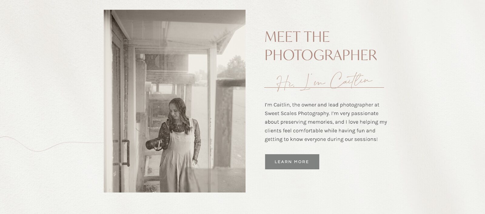
Sweet Scales Photography is a family and wedding photography studio in Lima, Ohio. Caitlin captures her clients’ big moments – and the little ones in between. She booked a Brand and Showit Web Design package with me!
Caitlin’s studio website reflects her natural, nurturing approach to family and wedding photography. The design feels like a breath of fresh air – light, airy, and wonderfully uncomplicated. Her new design creates an immediate sense of ease, much like the comfortable atmosphere she curates during her sessions with families.
Website design for photographers FAQs
Should You Put Prices on Your Photography Website?
There are a lot of opinions on this topic, but I stand firmly in the camp of showing your prices. Transparency about pricing helps build trust with potential clients and qualify leads from the very beginning. You don’t need to list every single package in detail, but sharing your starting prices or typical investment ranges helps qualified clients feel more confident to reach out (because they know that they’ll actually be able to afford your services).
Overall, putting prices on your photography website shows respect for your potential clients’ time and budget and often leads to more meaningful inquiries.
What Do Photographers Use for a Website?
There are so many website builder options for photographers (and other creatives), but Showit is often the best website builder for most photographers, whether you’re a commercial photographer, a wedding photographer, etc. Showit actually originally started as a website builder for photographers because they often need more creative control and flexibility than what more traditional platforms like Squarespace and WordPress can offer.
Showit is easy to use and beginner-friendly with beautiful templates! But I’d still recommend working with a brand & website designer instead of DIY-ing.
Is Wix or Squarespace Better for Photography?
Honestly, neither. Wix and Squarespace can be great website builders for other entrepreneurs and small businesses, but they often fall short for photographers who need more creative layouts and specialized features to aesthetically showcase their work. In my opinion, both Wix and Squarespace are limiting.
If you want to launch a photography website, consider using Showit instead! Showit gives you a ton of creative freedom to create unique layouts so you can communicate your bespoke touch and attention to detail visually. This can really increase the overall impression of sophistication and professionalism on your website!
How Should a Photography Website Look?
Your photography website should strike the delicate balance between showcasing your artistic vision and maintaining functionality. Focus on creating a clean, organized structure that complements your work, personality, and photography style without overwhelming your visitors. It should be easy for your potential clients to get the information they need about your services, packages, and processes.
How Many Photos Should a Photographer Have on Their Website?
There’s no one answer to this question because it’ll vary from one photographer’s website to another. Try to curate collections that tell complete stories and demonstrate your artistic style, but don’t include every single image you’re proud of on your Portfolio page. It can be overwhelming for your website visitors to scroll through hundreds of photos!
How Much Does a Photography Website Cost?
At the very least, you’ll need to cover technical expenses like your domain name and website hosting. These expenses typically stay below $100.
Many photographers also hire a designer to create their personal branding and website. Some also use photography templates, but I’d always recommend getting a custom design because it’s much more impactful! You can learn more about my packages and pricing on my Services page.
Get Sophisticated Website Design for Photographers That Engages and Transforms
Your photography website is one of the best ways to attract and connect with potential clients. Having active social media accounts is important, but they all have to lead somewhere – namely, your website. It’s the perfect space to showcase your work and express your personality and artistic vision.
As a brand & web designer, photographers are some of my favorite clients to work with! Learn more about how I can help you on my Services page or get in touch!
About the Author:
Rose Benedict
Owner and Designer, Rose Benedict Design
Rose Benedict is a brand and website designer for therapists, creatives, artists, and service providers. Rose is also a Showit Design Partner and the owner/designer at Rose Benedict Design. She has been a designer for the past 10 years and has worked at a Fortune 15 company and top university in Columbus, Ohio. She brings both her brand/website design and technical experience to small business owners so that they can thrive and deeply connect with their ideal clients. Outside of work, Rose loves reading, pilates, gardening, and traveling (10 countries and counting!).
Rose Benedict Design is a brand and Showit web designer based in Columbus, Ohio, devoted to crafting beautiful, strategic brands for creatives and service providers.
©2022-2026 ROSE BENEDICT DESIGN
Rose Benedict Design is a proud Showit Design Partner.