Health and Wellness Branding: 7 Steps to a Rooted Identity
Your health and wellness branding is the bridge between what your practice stands for and how the world experiences it. The strategy, or your mission, values, and positioning, give your brand depth. The visuals, such as your logo, colors, and typography, give it a face.
Both matter equally, and they work together to connect with your target audience.
As a brand and website designer for health and wellness businesses, I create branding that’s beautiful and purposeful, because you shouldn’t have to choose! Here are 7 steps to building a deeply rooted brand identity, plus examples to inspire you.
What Is Health and Wellness Branding?
Branding is the full picture of how your health and wellness business shows up in the world.
It starts with your brand strategy. That’s the decisions you make about who you are, who you serve, and why it matters. Then, it comes to life through your visual identity that carries those decisions into every client touchpoint.
On the strategy side, your brand includes:
- Your mission and vision
- Your core values
- Your brand story and origin
- Your unique value proposition
- Your brand voice and messaging
- Your target audience
On the visual side, it includes:
- Your main logo and logo variations
- Your color palette
- Your typography (heading and body fonts)
- Supporting design elements like patterns, icons, and illustrations
- Photography style
When your brand strategy is clear and the visuals are intentional, your potential customers get a cohesive brand experience that gives them an accurate sense of what it’s like to work with you.
This is especially important in the health and wellness industry, where clients are making deeply personal decisions about their bodies, mental health, and well-being. They’re looking for someone they can trust, and your brand is often the very first signal they receive.
A well-designed, strong brand identity tells them you’re thoughtful, professional, and invested in the experience you provide.
In fact, 81% of consumers need to trust a brand before they buy, and 94% recommend brands they feel emotionally connected with.
How to Craft a Deeply Rooted Health and Wellness Brand Identity
1. Identify your target audience
Every design decision you make ultimately depends on who you’re trying to reach. If your brand’s target audience is “anyone who needs health and wellness support,” that’s too broad to guide meaningful branding choices.
Get specific!
For example, maybe you are:
- A nutritionist working with postpartum women
- A therapist specializing in burnout for healthcare workers
- A functional medicine practice serving families with young children
The more clearly you can define your ideal client, the easier every other branding decision becomes.
A common concern I hear is, “But I work with multiple client types, how do I speak to them?”
In those cases, I look at what those clients have in common (values, beliefs, decision criteria, etc.) rather than only demographic categories. At the same time, their differences still matter, and those more specific needs or life stages could be addressed through individual service pages or offers within their website.
It’s important to spend time learning what your ideal clients care about, what language they use to describe their struggles, and what draws them to one provider over another.
You can do this through client intake conversations, Instagram polls, surveys, or even casual questions during sessions. Pay attention to the words they use! Those words should eventually show up in your messaging.
In health and wellness specifically, clients are often navigating something vulnerable. They want to feel seen and understood before they reach out. When your brand speaks to their experience, that recognition builds a lot of trust.
2. Define your brand values
Brand values are easy to list…and harder to live!
A value only means something when it shows up in how you operate.
For example, if one of your values is accessibility, that could look like transparent pricing on your website, a sliding scale option, or content that avoids overly clinical jargon so people without a medical background feel welcome.
Or, if your value is integrity, maybe that means you don’t upsell services clients don’t need, or you’re upfront about what your scope of practice covers and what it doesn’t.
These don’t have to be massive to be impactful!
A value like “simplicity” might mean you keep your intake process streamlined and stress-free because you know your clients are already overwhelmed by the time they find you. That’s a small thing that makes a big difference in how people experience your brand.
The point is that your values should be woven into your brand experience and visible in your design choices, copy, client process, and policies.
When they are, clients feel it, even if they can’t pinpoint exactly why your brand feels trustworthy.
3. Avoid clichés
Health and wellness branding often falls into the same visual patterns of things like stacked stones, meditation on a cliff, or open hands. When everyone uses the same visual cues, your brand risks blending into the background because your audience can’t tell you apart.
Forming an emotional connection with your audience requires digging into what makes your work different.
The same goes for messaging. Phrases like “mind, body, and soul,” “your journey to wellness starts here,” or “healing from the inside out” have been repeated so often that they’ve lost their ability to differentiate you.
Instead, dig deeper. When your language and visuals reflect the real nuances and benefits of your work, your brand will feel more resonant and memorable.
4. Lean into your brand personality
Brand personality is how your brand feels to people with its tone and energy. And it doesn’t have to mean loud, bold, or quirky. For many health and wellness brands, personality shows up in quieter ways, like warmth, calm confidence, and sophistication.
What matters is that your personality is distinct and consistent.
When someone visits your website, scrolls through your Instagram, and then walks into your office (or logs onto a virtual session), the experience should feel cohesive. They should recognize you.
A lot of the health and wellness brands I work with don’t want to look too clinical, but they also want to be taken seriously as professionals.
That’s where building a brand identity that both looks polished AND has a unique personality becomes so important! Here’s an example of branding for a psychotherapy practice that’s both expert and a little airy and soft:
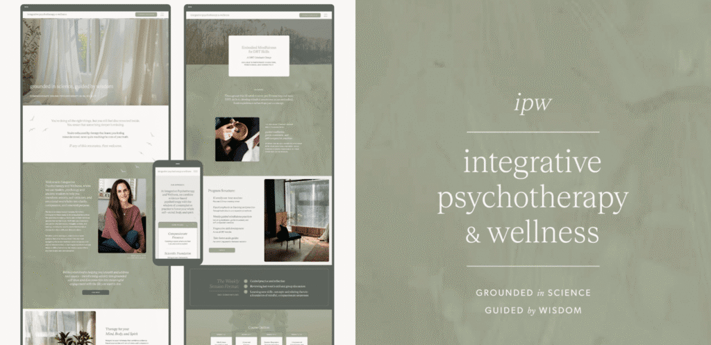
For Integrative Psychotherapy & Wellness, I designed a sage-toned identity with elegant serif typography and nature-inspired textures. It’s polished without being cold!
5. Choose your fonts and color palette
Your color palette and typography set the mood before someone reads your private practice website or social media post. In fact, color increases brand recognition by up to 80%!
In health and wellness, there’s a tendency to default to green. Green is a beautiful color, and it works well for many brands, but it’s not a requirement. Your palette should come from your brand strategy and the emotional experience you want to create for your clients.
For example, take these two palettes I designed for very different private practices:
The Vibrant Tapestry is an online therapy practice for aging adults in Washington state. Renee’s mission is to honor the unique stories and complexities of her clients as they navigate life transitions.
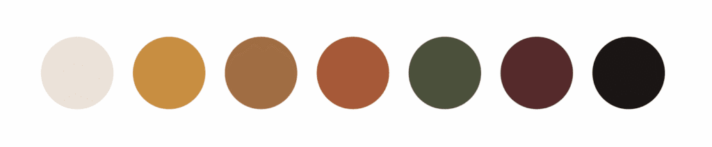
The palette reflects Renee’s approach with warm golds, rich terracotta, a deep olive, and a grounding burgundy. It feels textured, layered, and full of warmth.
These aren’t colors you’d typically associate with therapy branding, and that’s intentional!
They mirror the richness and depth of the stories Renee’s clients carry.
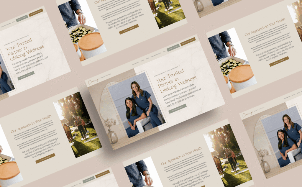
On the other hand, Concierge Health Partners is a private practice offering concierge primary care and functional medicine in the Woodlands, Texas.
The palette here is completely different, with soft creams, muted sage, warm beige, and dark charcoal. It’s clean, elevated, and organically modern, reflecting the refined and professional experience their members receive.
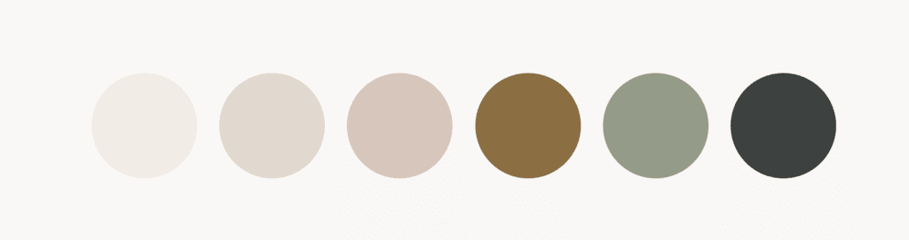
Both brands are in the health and wellness space, and both use earthy tones. But the palettes tell very different stories because they’re rooted in very different strategies, audiences, and brand personalities.
6. Curate high-quality visuals
You can have the most beautiful color palette and fonts, but if your photography and visuals aren’t up to the same standard, your brand’s visual identity will often feel disjointed and incomplete.
Visuals are often the first thing people notice, and in health and wellness, they carry a lot of weight.
My top recommendation is always to invest in a professional brand photo shoot. A photographer can capture your space and brand in a way that feels authentic and polished.
If a full shoot isn’t in your budget right now, use high-quality stock photography that aligns with your brand’s aesthetic. Some of my favorite sources are:
They offer options that feel elevated and natural, many of them for health and wellness brands focused on both services or products.
7. Think of branding as visual storytelling
Every health and wellness brand has a story, and your branding is how you tell that story visually.
When your color palette, typography, imagery, and messaging all come from the same strategic foundation, they work together to communicate something that words alone can’t.
A potential client should be able to land on your website and feel what it would be like to work with you. That emotional response is what moves someone to pick you, even in a crowded market.
This is why I always start my design process with strategy.
The visual identity has to grow out of something rooted, including your mission, values, personality, and target audience.
When it does, the branding becomes the visual expression of everything your practice stands for, and THAT is what creates a lasting connection with the people you’re meant to serve.
Health and Wellness Branding Examples
Here are a few health and wellness branding ideas to get you inspired!
Concierge Health Partners of The Woodlands

Concierge Health Partners is a private family practice offering concierge primary care and functional medicine in the Woodlands, Texas.
Dr. Blessing needed a brand that felt both earthy and elegant. It had to be professional enough for a medical practice, but warm enough to reflect the personalized care her members receive.
I designed an elevated organic modern identity with soft sages, warm neutrals, and clean typography. The Showit website is simple to navigate, SEO-optimized, and HIPAA-compliant.
Brand adjectives: warm, refined, earthy, professional, and holistic.
Rise Neuro Rehab
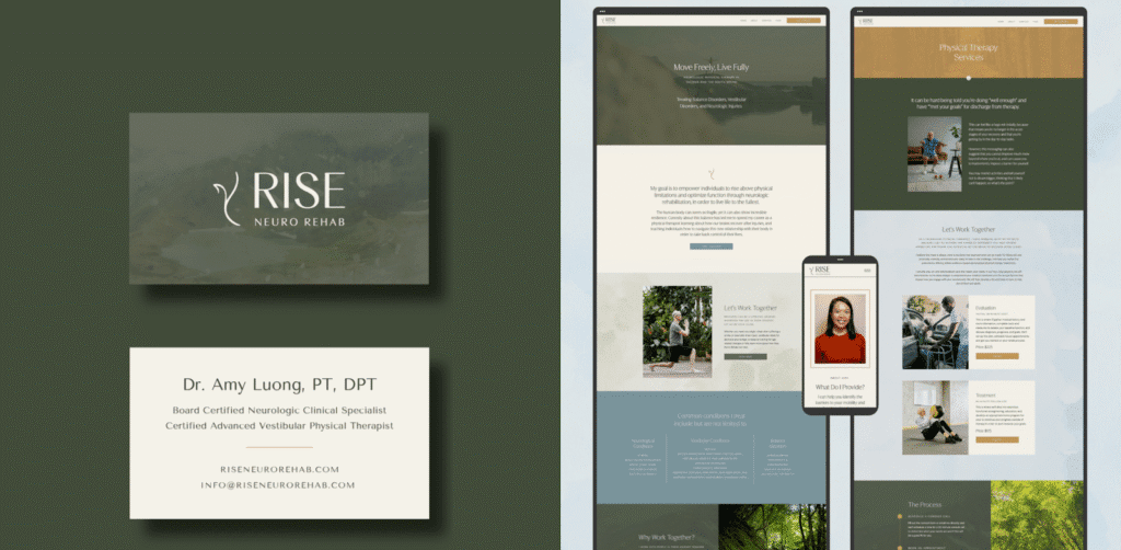
Rise Neuro Rehab is a physical therapy practice in Tacoma, Washington, specializing in neurologic physical therapy for balance, vestibular rehab, and neurologic injuries.
Amy needed her brand to feel optimistic and inclusive. She serves a wide range of individuals, so the visuals had to be gender-neutral while reflecting the natural beauty of the Pacific Northwest.
I designed a minimal, calming identity with earthy tones and flowing design elements that evoke both possibility and groundedness.
Brand adjectives: minimal, earthy, calming, inspiring, flowy.
Jodi Berman, PhD
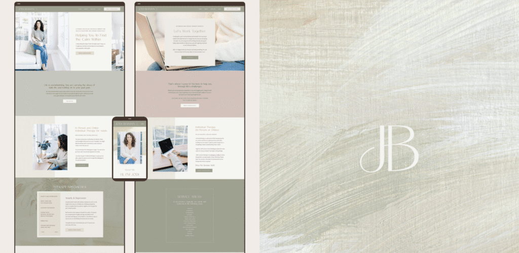
Jodi Berman is a therapist based in Westport, Connecticut, supporting clients across the state through anxiety, depression, motherhood, and major life transitions. She wanted to attract more private-pay clients and knew her brand needed to reflect the calm, grounded experience she provides.
I created a clean, organic, and modern identity with a soothing neutral palette and plenty of white space. That’s the kind of visual breathing room that puts potential clients at ease the moment they land on her site!
Brand adjectives: warm, reflective, comforting, empowering, peaceful.
Community Connections Therapy
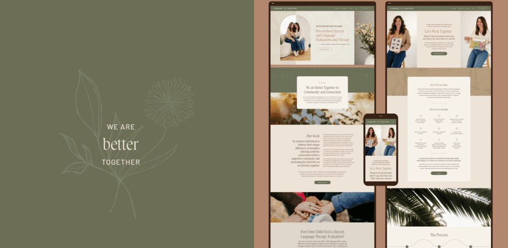
Community Connections Therapy is a speech and language therapy practice founded by twin sisters, Victoria and Christina, in Columbus, Ohio. Their work centers on empowering parents and children through education, therapy, and community involvement.
They wanted branding that felt earthy, welcoming, and a little boho-inspired, with a strong emphasis on diversity.
I designed a warm palette anchored by olive green with soft terracotta and cream, and created a custom logo featuring a diverse community of botanical elements arranged in a circular pattern. It symbolizes growth, connection, and inclusivity.
Brand adjectives: soft, rooted, professional, empowering, warm, natural.
The Vibrant Tapestry
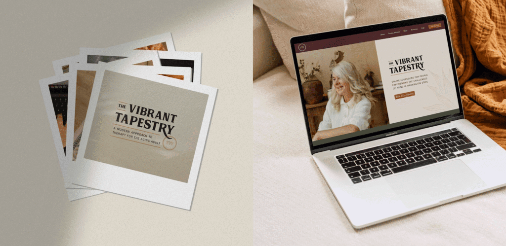
The Vibrant Tapestry is an online therapy practice for aging adults in Washington state. Renee’s mission is to honor the unique stories, perspectives, and complexities of her clients as they navigate life transitions.
The brand needed to feel warm, accepting, and nurturing. It’s a space where older adults feel seen and welcomed. I designed an earthy palette of rich golds, terracotta, olive, and burgundy with grounded textures that reflect the depth and richness of the lives her clients have lived.
Brand adjectives: earthy, warm, nurturing, grounded, peaceful.
Health and Wellness Branding Services: How Do I Find the Right Fit?
Choosing a brand designer is a big decision, especially in an industry where your visuals need to build trust with people making personal choices about their health.
Here are a few things to look for:
- They treat strategy and beauty with equal weight, using one to inform the other
- They’re detail-oriented and put meaning into every color choice, font pairing, and design element
- They have experience working with health and wellness brands and understand the nuances of the industry (like ethical messaging, HIPAA compliance, and legal considerations like adding disclaimers)
- They make the process of working with them simple and organized
- They take the time to research your audience, values, and positioning before starting to design your branding
- Their portfolio shows range, and their work looks and feels distinct from client to client
It’s often a good idea to get on a discovery call with a few designers to see if you align!
Get Custom-Crafted Branding for Health and Wellness
As a brand and Showit website designer, I specialize in creating custom brands and websites for health and wellness professionals, including therapists, physical therapists, medical practices, and wellness providers.
My process starts with strategy and ends with a beautiful, cohesive brand identity that’s deeply rooted in who you are, who you serve, and what makes your practice different.
If you’re ready to build a health and wellness brand rooted in purpose, learn more about my services or get in touch!


