Earthy Color Palette: 9 Ideas From a Brand & Website Designer
So, are you looking for earthy color palette ideas? Then you’ve landed in the right place!
Wherever you are in your branding journey, you may find that you’re gravitating towards a different vibe from when you started. That’s part of a natural progression that involves honing your business process and services, as well as better understanding what you like and what your clients like.
A strong brand identity includes many elements, but a sophisticated yet earthy color palette is one of the most fun parts! Here are a few color scheme examples, created by a brand & website designer for creatives (me! 👋).
What Do Earth Tones Mean?
Warm earth tones can remind you of sun-baked clay, rich soil after rain, or weathered wooden beams in old barns. Cooler earthy tones may feel like moss-covered stones, the silvery bark of birch trees, or misty mountain slopes at dawn.
These colors root us in the natural world and create an immediate sense of stability and groundedness. When you use them in your branding as a creative, you convey authenticity and other qualities that resonate deeply with modern audiences who’re craving genuine connections.
If you’re a service provider, such as a therapist, a photographer, a wedding professional, or another creative, earthy tones can build trust through their association with permanence and reliability.
Popular Earth Tone Colors
This is a non-exhaustive list, but here are a few earthy shades that I like using in my brand & website projects for creatives because they add depth and create an inviting atmosphere around your brand.
- Terracotta: A sun-warmed orange-brown that reminds me of Mediterranean pottery and desert landscapes
- Umber: Deep brown with red undertones, reminiscent of fertile soil and aged leather
- Sage green: A muted green that mirrors the soft, dusty leaves of its namesake herb
- Ochre: Golden-yellow brown that feels like ancient cave paintings and autumn wheat fields
- Sienna: Rich reddish-brown that brings to mind sun-baked earth and rustic wooden furniture
- Moss: Deep, saturated green with grey undertones, like forest floors after rain
- Charcoal gray: Warm pinkish-brown that captures the earthy richness of natural clay deposits
- Mushroom: Soft greyish-brown that echoes forest floors and weathered stone
- Olive: Warm green-brown that reflects the natural depth of its namesake fruit
- Lime green: Fresh, vibrant green with earthy undertones, it reminds me of spring growth
- Deep blues: Inky indigo tones that feel like midnight skies over desert landscapes
These rich tones and complementary colors can work beautifully for creative entrepreneurs! Here are a few examples of earthy color palettes that I created.
9 Earthy Color Palette Examples from a Brand Designer
Campfire
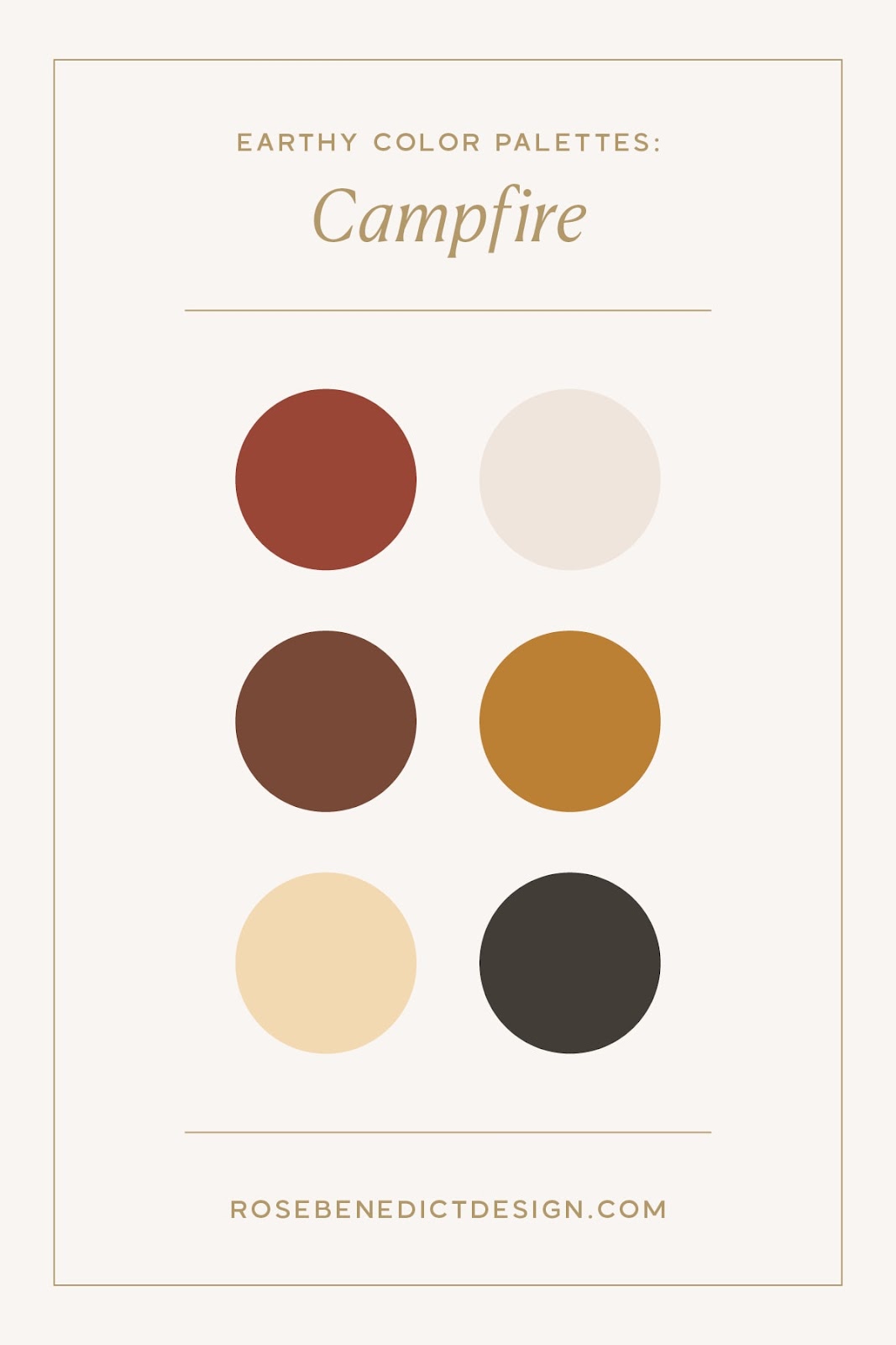
If I were to choose a color palette that’s different from the one I currently use, it would probably be this one. I love the dark, warm, cozy colors. These colors invoke a welcoming, communal, warm feeling.
If your branding and website included these colors, you would be communicating to your audience that you are here to welcome them in a cozy, authentic, relaxed way. This color palette would work well for coffee shops, chocolatiers, Etsy shops, artisans, designers, copywriters, or photographers.
Gone Fishin’
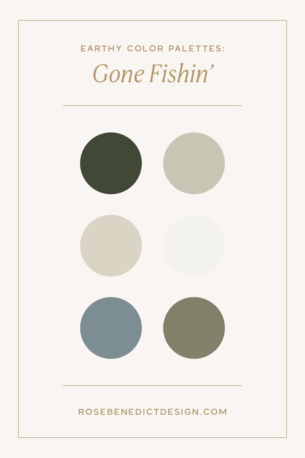
The greens and browns in this color palette are making me want to go camping! I love a natural yet understated color palette, and this one could go in so many different directions. I could see this one working well for a lot of different artisans, photographers, gardeners, landscapers, interior designers, web designers, or copywriters.
Here’s an example of a client project with a similar earthy color palette: Native Landscapes and Gardens.
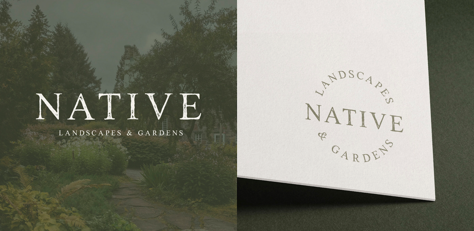
They’re a landscape and garden design company that provides their customers with sustainable and eco-friendly designs that incorporate easy-to-maintain native plants. Marc, the owner of Native, wanted the branding to feel earthy yet sophisticated, so that’s exactly what I did!
Desert
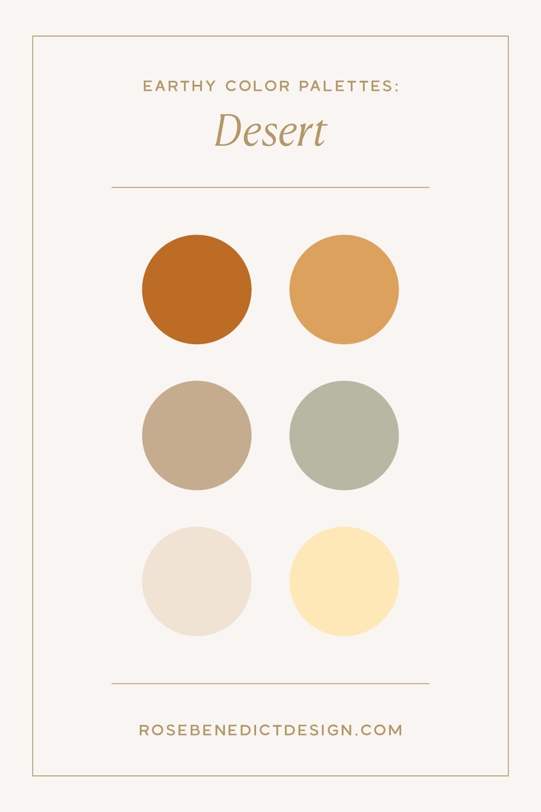
This one makes me so happy! The bright, warm, and friendly tones in this color palette definitely remind me of someone with a sophisticated yet bubbly personality.
It overflows with warmth and optimism, and I feel like this color palette would be great for SEO experts, marketers, CRM experts, copywriters, or business coaches. Since these are such friendly and encouraging colors, they’d be perfect for a professional who prides themselves on making intimidating subjects easier to understand.
Mountain Air
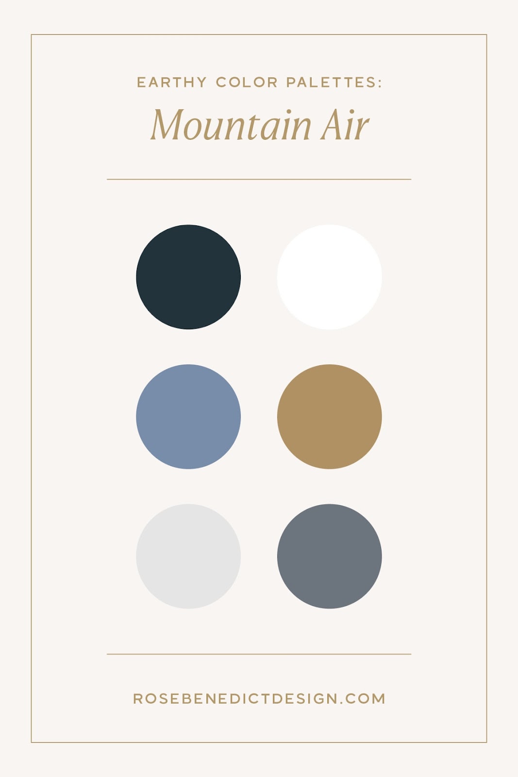
This color palette is one of my favorites! It’s a more serious color palette that creates a feeling of credibility and sophistication without being stodgy.
This would be amazing for a lawyer, accountant, business consultant, interior designer, or photographer. There is so much potential here since the palette includes mostly neutrals. I’d love to use this one in a project sometime soon!
Canyon
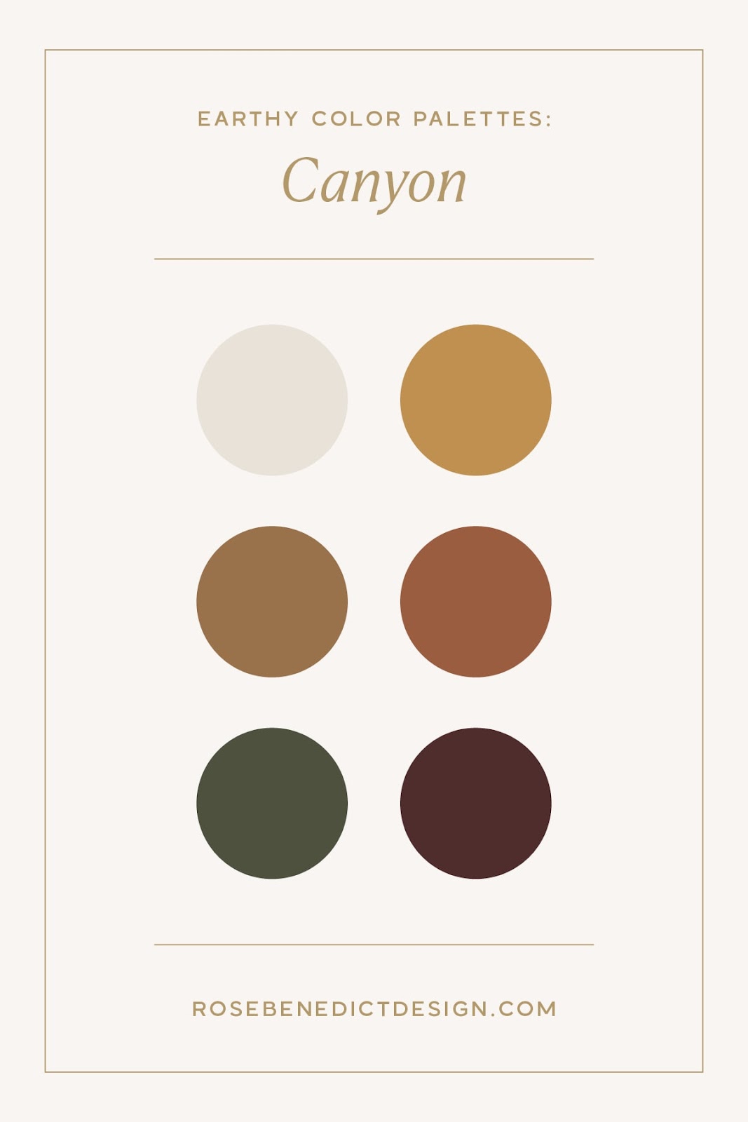
Think of this color palette as being similar to the Gone Fishin’ color palette, but warmer, friendlier, and a little bit brighter! Since this color palette includes the natural hues found in nature, it would be perfect for a nature-based business, an artisan, or someone who focuses on organic, natural products.
This gender-neutral palette has a ton of possibilities, and I can’t help but gravitate toward the greens in this one. A recent project I did for a therapist for aging adults, The Vibrant Tapestry, aligns with this earthy color palette!
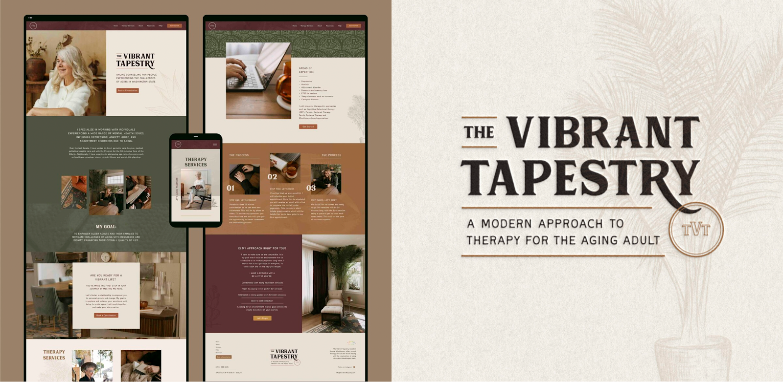
Renee, the Founder of The Vibrant Tapestry, is an online therapist for aging adults based in Washington state. She helps her clients honor the unique stories, perspectives, and complexities as they grow older into adulthood, and she wanted her branding to feel warm and accepting.
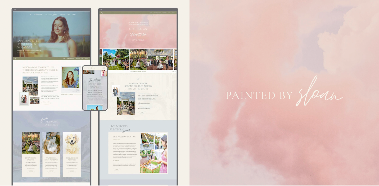
Sunrise
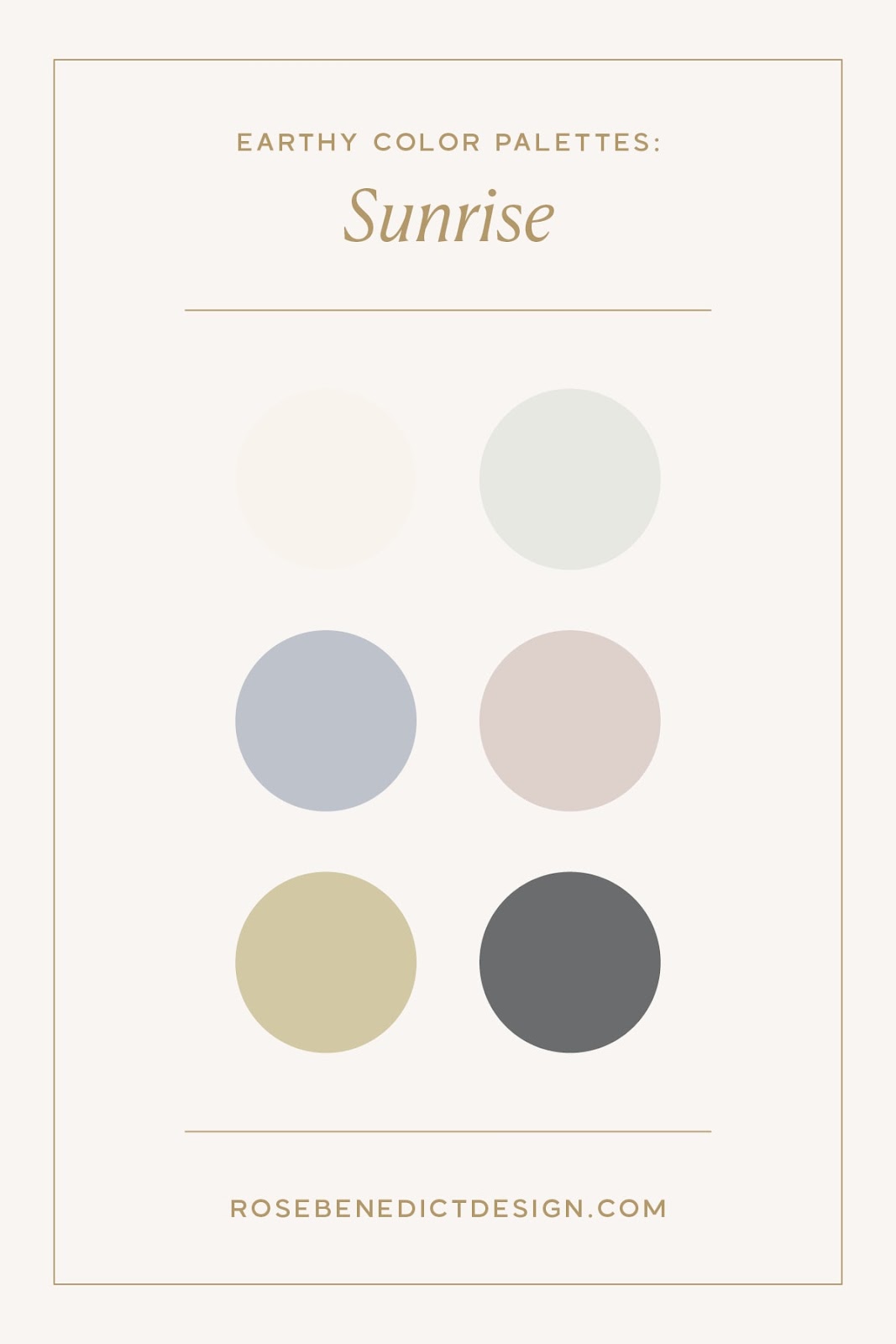
This color palette transports me to the sunrise on the East Coast, where I’m walking along the beach on my way to a lighthouse. This is perfect for a soft, feminine, and sophisticated brand.
I could especially see this being used for a family and newborn photographer, or perhaps a wedding photographer as well! Someone whose personality is light, airy, bubbly, and friendly would definitely gravitate toward this color palette.
Someone like…my client, Painted by Sloan! I designed her branding & website with these crisp yet earthy tones in mind, and it turned out such a beauty! 😍
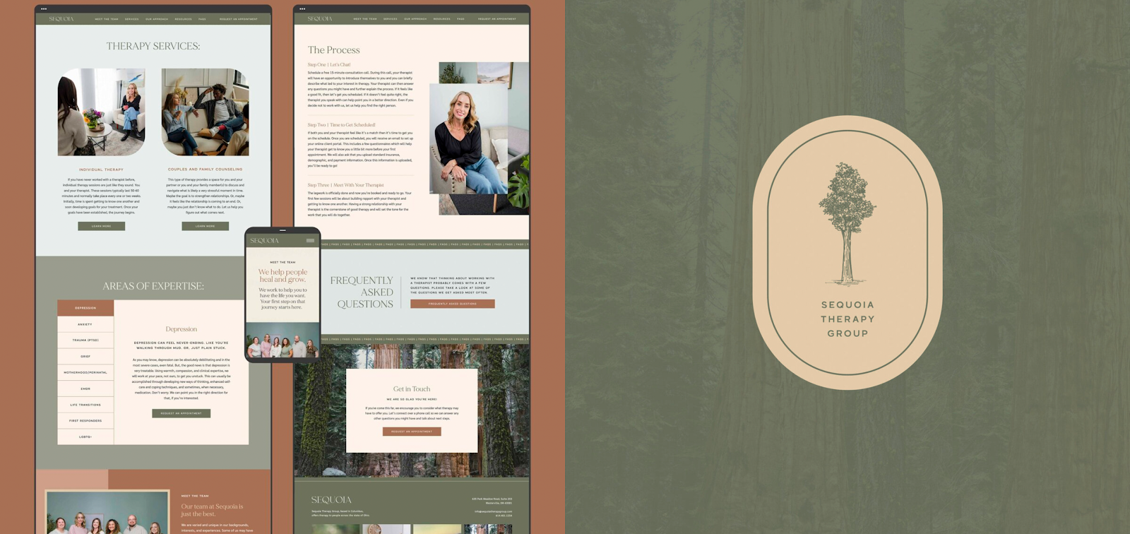
Sequoia
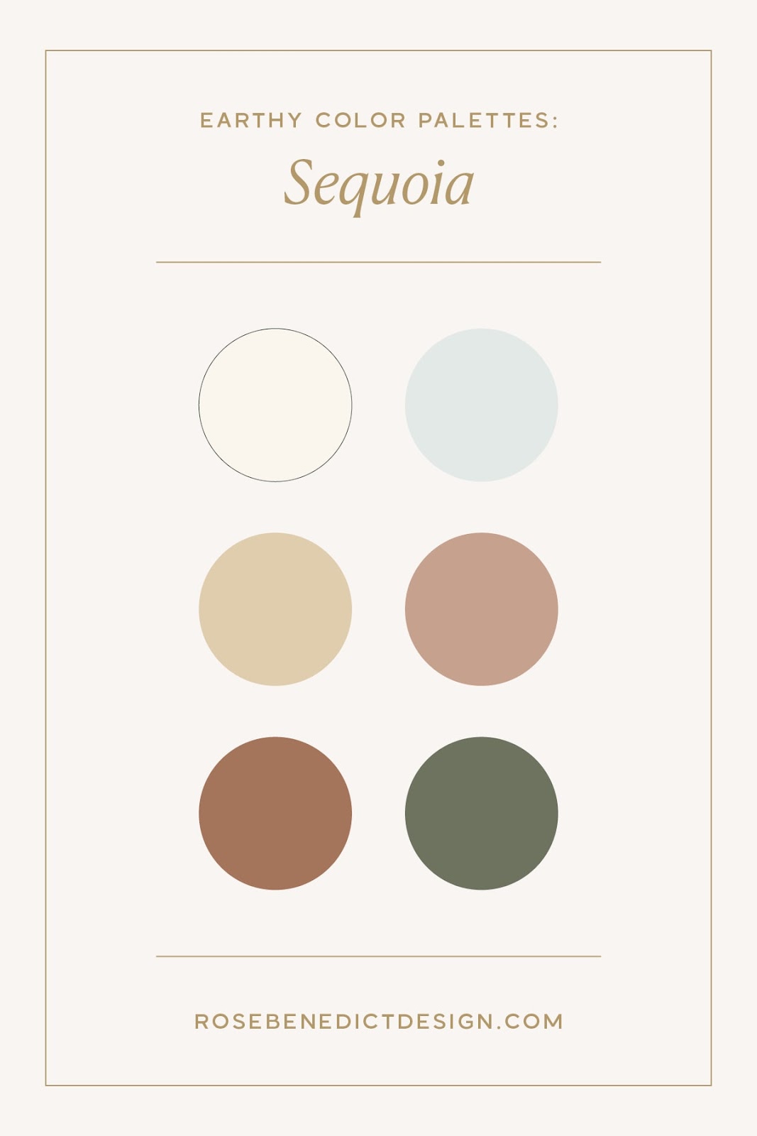
To me, this earthy color palette feels like a misty morning in old-growth forests, with soft light filtering through the branches. I’m drawn to how the sage green and deep brown anchor the palette, and the lighter tones create breathing room and elegance. There’s something grounded yet refined about it!
This palette would work great for practitioners like therapists, life coaches, or holistic wellness providers. I used similar earth tones for my client Sequoia Therapy Group, to cultivate warm, earthy, and welcoming online presence.
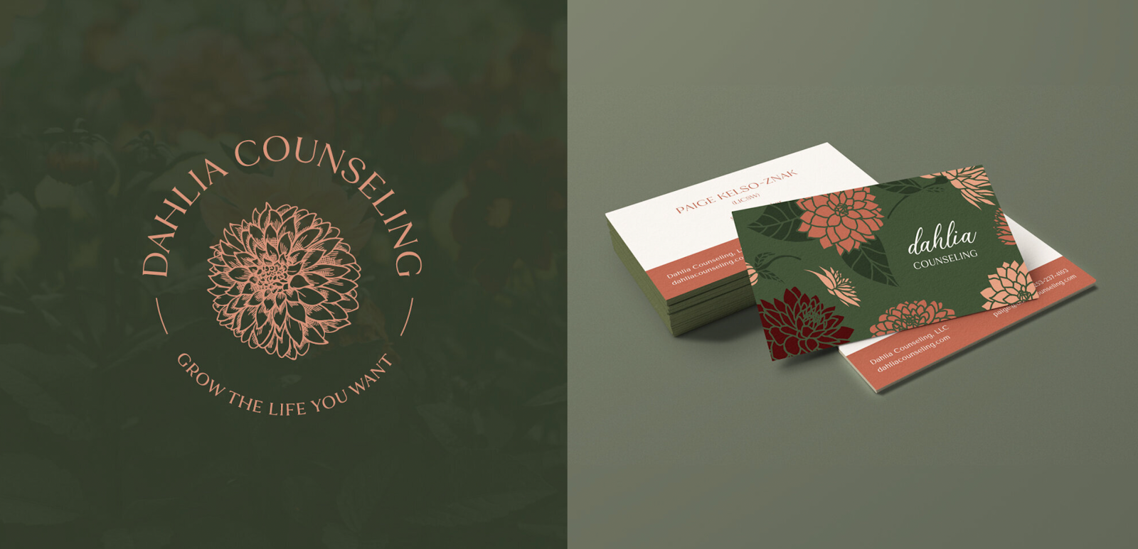
Garden
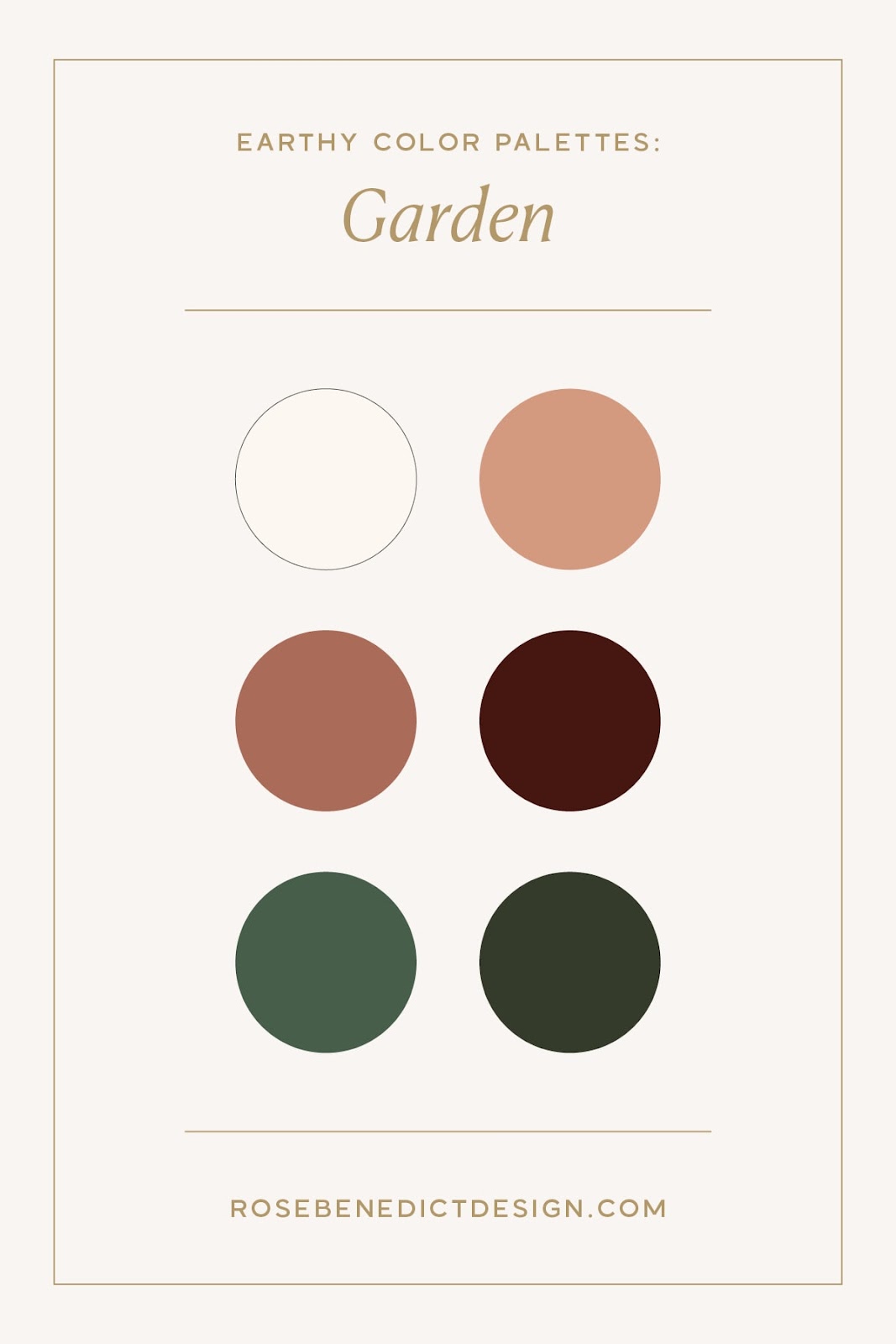
This earthy color palette makes me feel like I’m standing in a well-loved greenhouse at golden hour, with terracotta pots lining wooden shelves and herbs stretching toward the last rays of the sun.
I love how the deep forest greens pair with rich browns to communicate abundance and growth, and there’s a little crisp to add a splash of modern freshness!
I crafted a similar color scheme with earth tones for my client, a women’s therapist Dahlia Counseling, and I absolutely adore the combination of earthy depth and a few bolder, brighter colors.
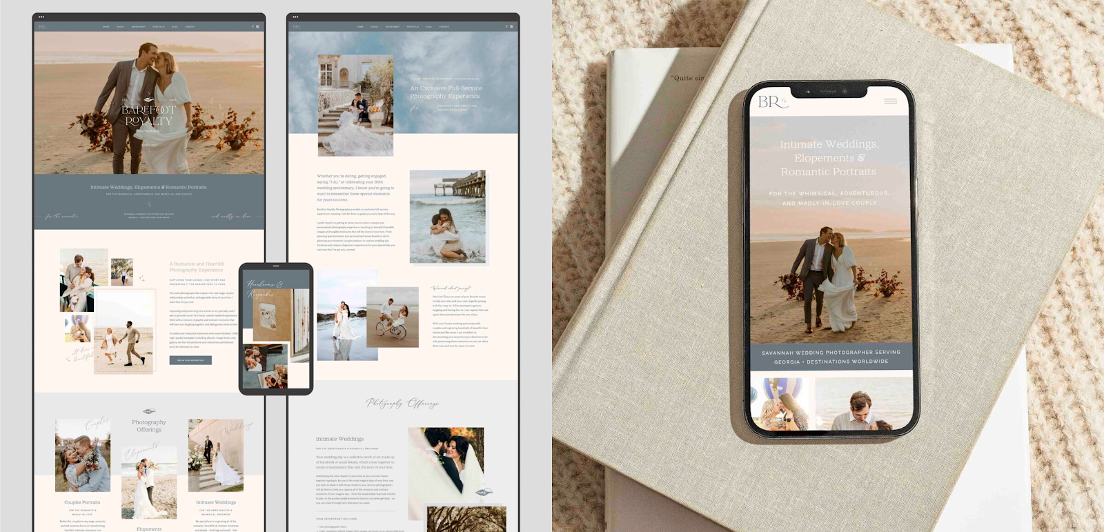
Seaside
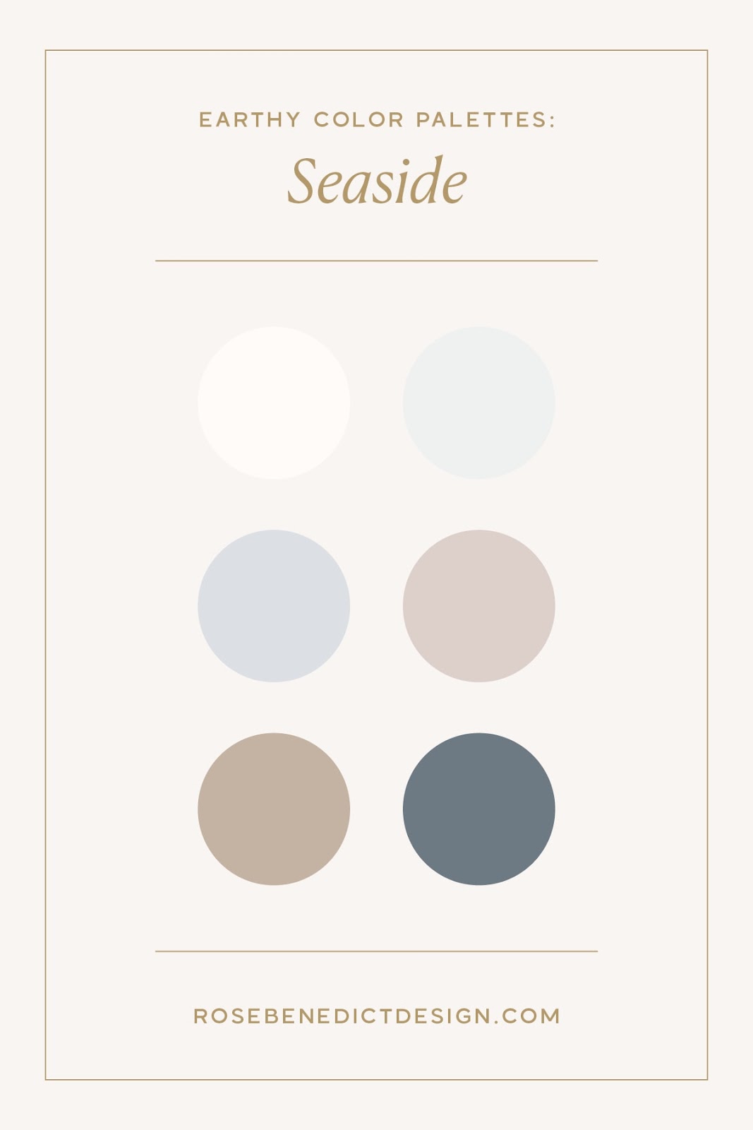
The Seaside palette translates the serene mood of an early morning on a quiet beach. It makes me think of driftwood, smooth pebbles, and pieces of sea glass softened by salt water.
These muted coastal tones will bring a sense of calm and sophistication to your brand, and I love now the deeper slate blue grounds the lighter, airy shades.
I created a brand identity with similar earth tones for my client, Barefoot Royalty Photography. Christine is a wedding, elopement, and couples photographer, and she wanted her brand & website to convey a high-end, romantic, and coastal-inspired look.
FAQs
What Are the Earthy Colors?
There are SO many earthy tones, but I like to think of them as rich tones found in soil, clay, stone, and woods – including warm browns, terracottas, deep greens, and muted golds. There are deeper and bolder shades, such as umber and sienna, as well as softer tones, such as sage, mushroom, and sand. All of them have a natural “grounded” quality that connects them to the earth’s organic elements.
What Colors Remind You of Nature?
To me, some of the most evocative natural colors are found in unexpected places, like the purple-gray of storm clouds or the soft pink of desert rocks at sunset. I think many people automatically think of greens when they think about nature, but colors like the deep blues of mountain lakes can also be earthy colors.
Is Burgundy an Earth Tone?
While burgundy isn’t a traditional earth tone, it shares qualities with earthy reds like clay and sienna, so it can work for some earthy color palettes. It carries the depth and sophistication of earth tones, but it also adds a touch of luxury and drama to the natural color schemes.
What Complements Earth Tones?
Earth tones pair beautifully with both crisp neutrals and subtle pops of color. Bright whites and soft creams create contrast and lightness. Deeper shades like navy or forest green add depth. You can also experiment with metallic accents, such as brass and copper, to bring warmth and sophistication to earthy palettes.
Are Earth Tones Warm or Cool?
Earthy tones can be both warm and cool, but they’re typically on the warmer side. Most earth tones draw from soil, wood, and clay, but cooler colors like sage green and stone gray can work amazingly for your earthy brand identity as well.
What Is the Color Psychology of Earth Tones?
Earth tones tap into our innate connection to nature and promote feelings of stability, reliability, and groundedness. These colors can reduce anxiety and create a sense of safety and comfort. For creative service providers, earth tones can positon them as trustworthy experts who value authenticity over trends. The natural depth of these colors communicates a mature, established presence while still feeling warm and approachable.
Can Earth Tones Be Used in Interior Design Projects?
Absolutely! You can use earth tones in all kinds of design projects, especially in interior design. For more tips on using a color palette of earth tones, check out this design article I was featured in!
Get an Earthy Brand Identity and Website Design
Want to learn what else creates a successful brand identity and website design? Let’s meet to discuss what your brand and web design project could look like!


